Grid Based: Grid Thumbnails
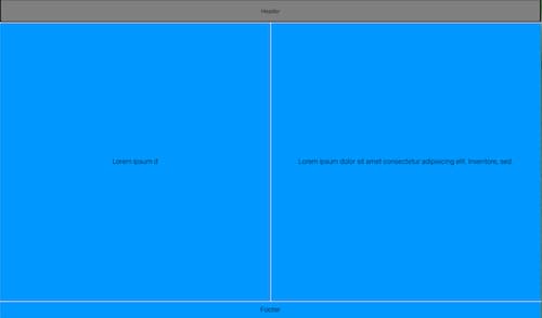
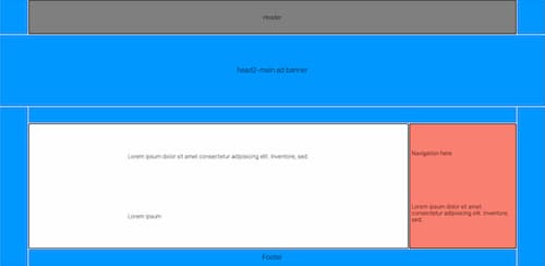
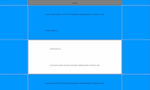
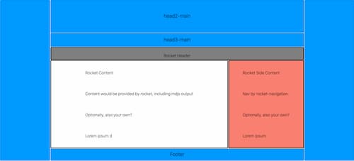
These screenshots demo CSS grids - used to lay out the fins-rocket-themes.
Since CSS grid hasn't gained mass popularity yet, showing the layout gives the prospective user some means of evaluating the approach for this use case.
errata
- Some screenshots are snipped at the bottom, when too long.
- All are from early in the design process and may have morphed since.
not-alphabet theme
From this archetype:

This grid area blocking:
not-apnews theme
From this archetype:

This grid area blocking:
not-axios theme
From this archetype:

This grid area blocking:

not-codesign theme
From this archetype:

This grid area blocking:
not-five38 theme
From this archetype:

This CSS grid area layout:
not-fuelcell theme
From this archetype:

This grid area blocking:
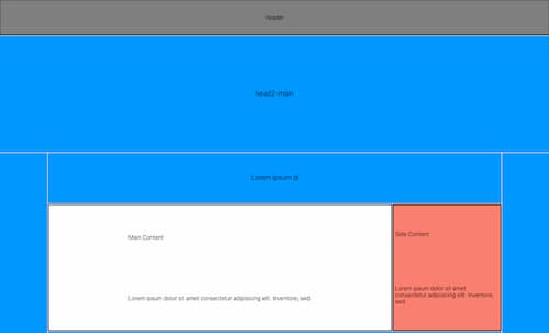
not-github theme
From this archetype:

This grid area blocking:
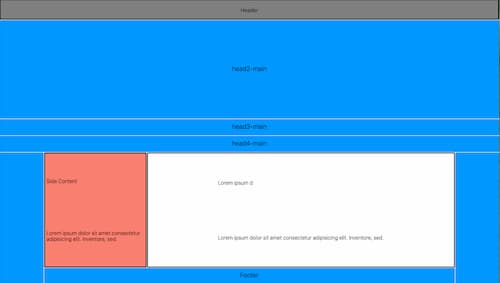
not-ibm theme
From this archetype:

This CSS grid area layout:
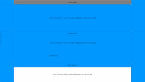
not-next theme
From this archetype:

This grid area blocking:
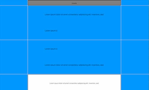
not-npr theme
From this archetype:

This grid area blocking:
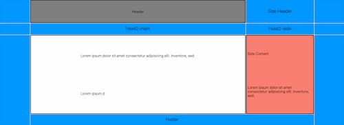
not-nyt theme
From this archetype:

This grid area blocking:
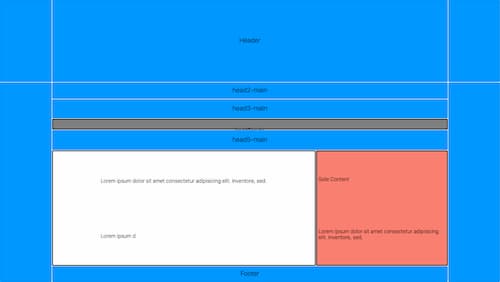
not-optimize theme
From this archetype:

This grid area blocking:
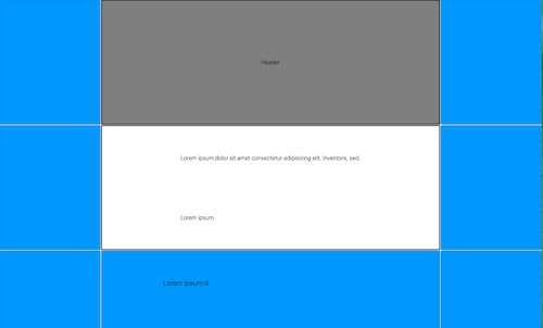
not-reddit theme
From this archetype:

This grid area blocking:

not-rocket theme
From this archetype:

This CSS grid area layout:
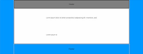
not-slashdot theme
From this archetype:

This grid area blocking:
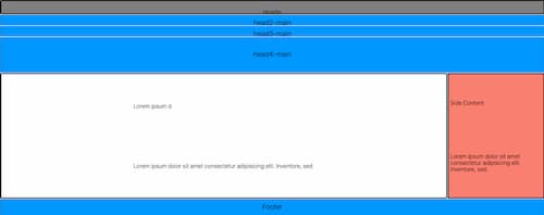
not-virgin theme
From this archetype:

This grid area blocking:
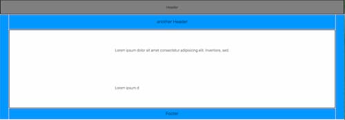
not-wikipedia theme
From this archetype:
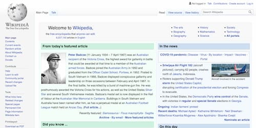
This grid area blocking:
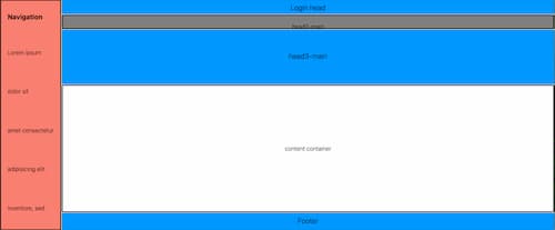
not-wired theme
From this archetype:

This grid area blocking:
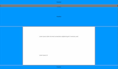
Internal pages
Any theme would naturally have both of these layouts:
- a home page (such as all above home pages starting with prefix "not-")
- internal pages, displayed with the
with-sidebarlayout in the rocket codebase
When you select one of the not- prefixed themes above, each comes with a sidebar layout theme for internal pages.
This general idea, for starting out:
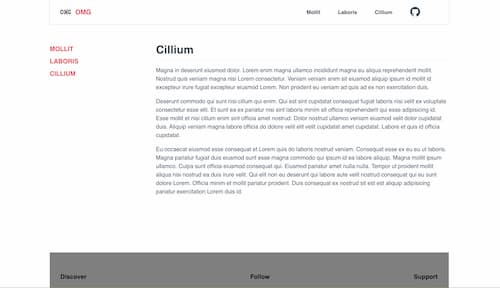
One example of grid area blocking:
Each implementation varies, but they tend to start from something like this, and then morph from there
